About project
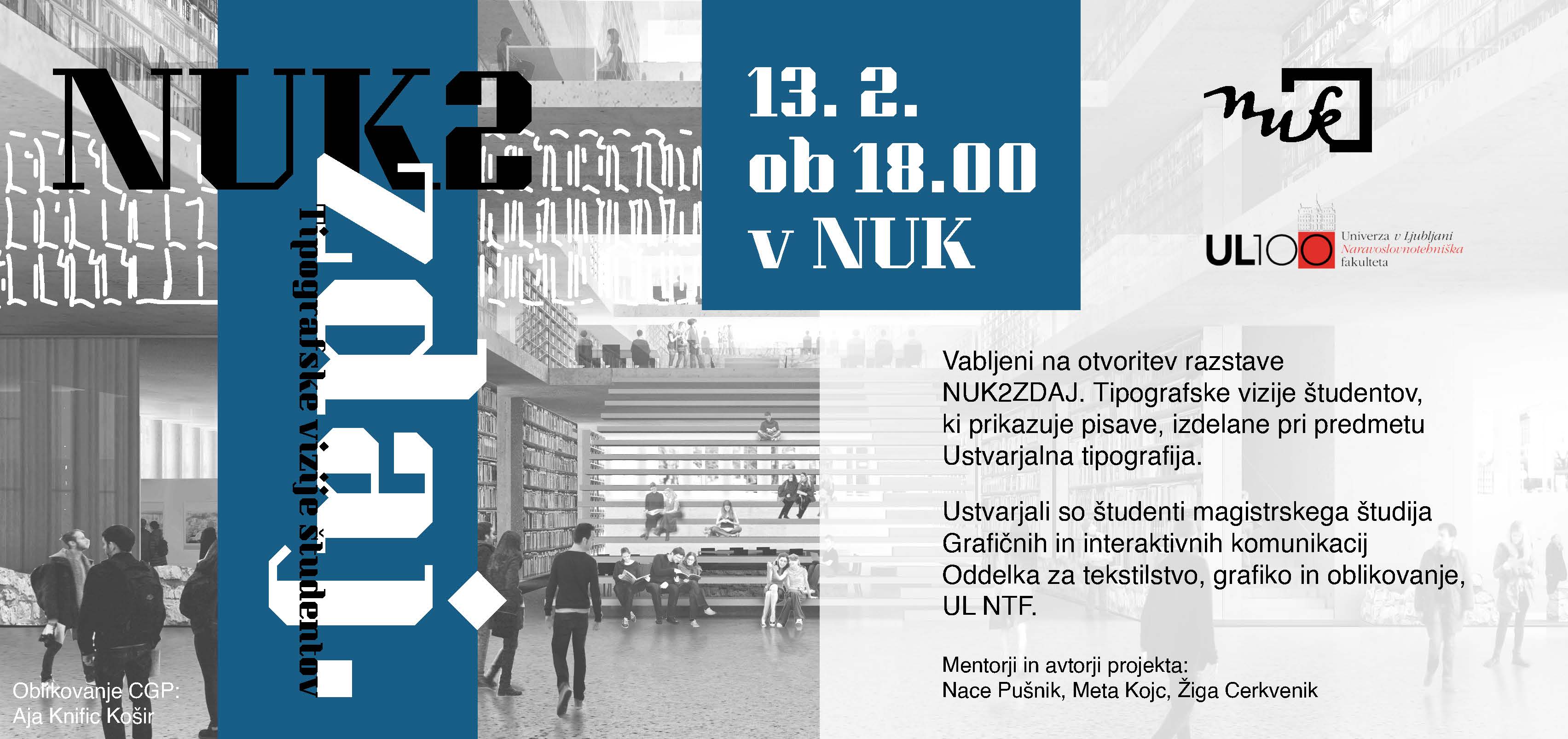
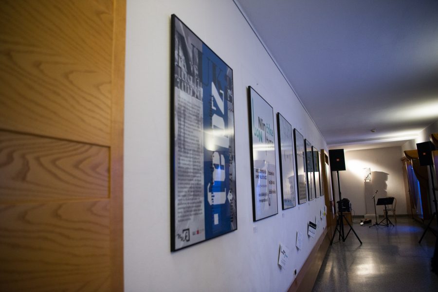
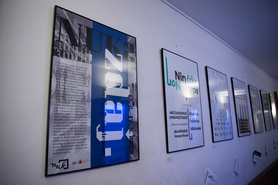
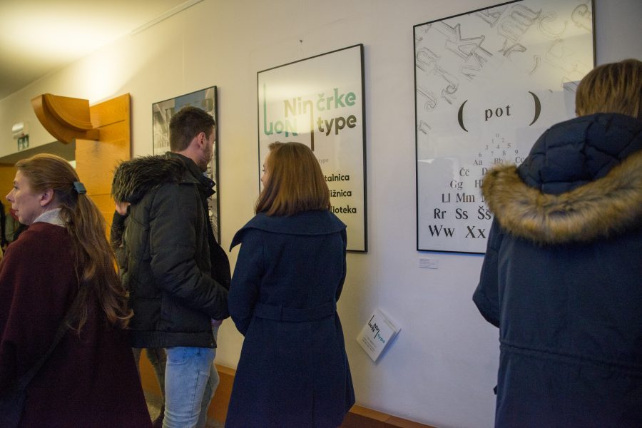
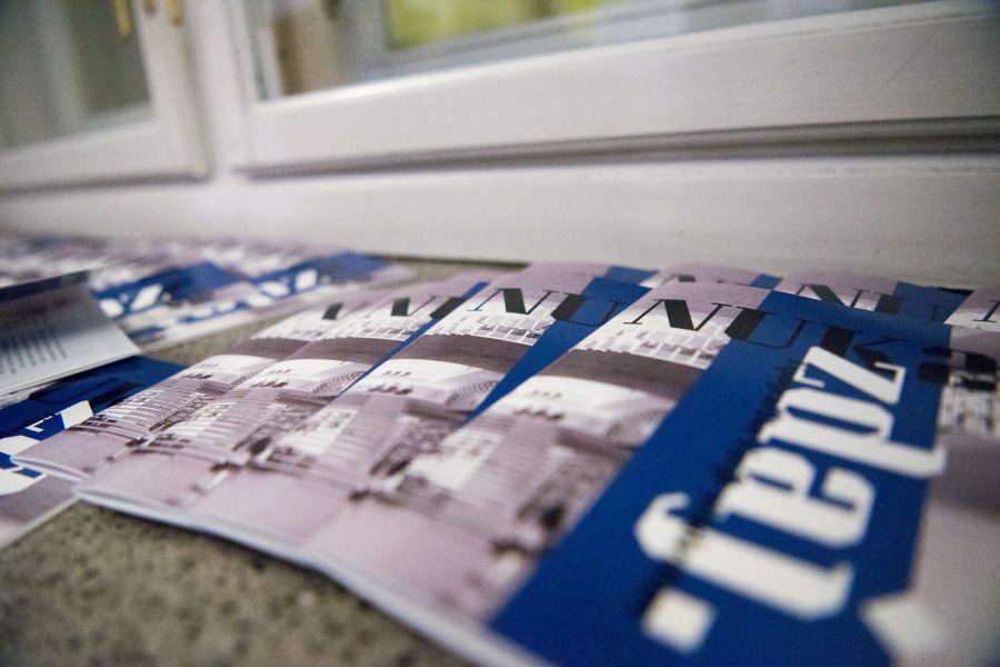
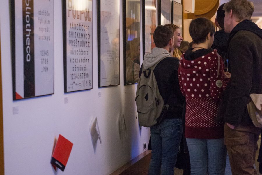
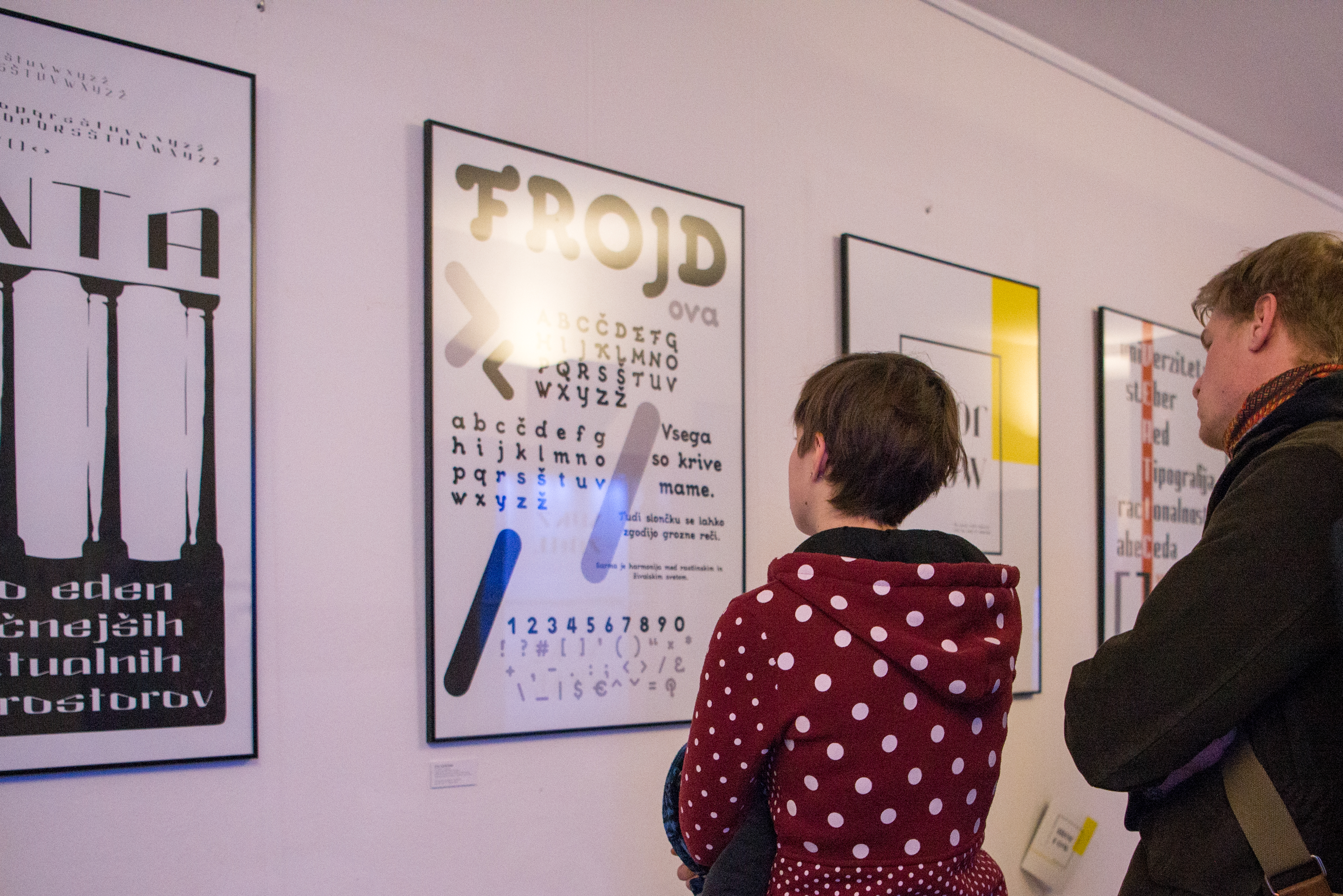
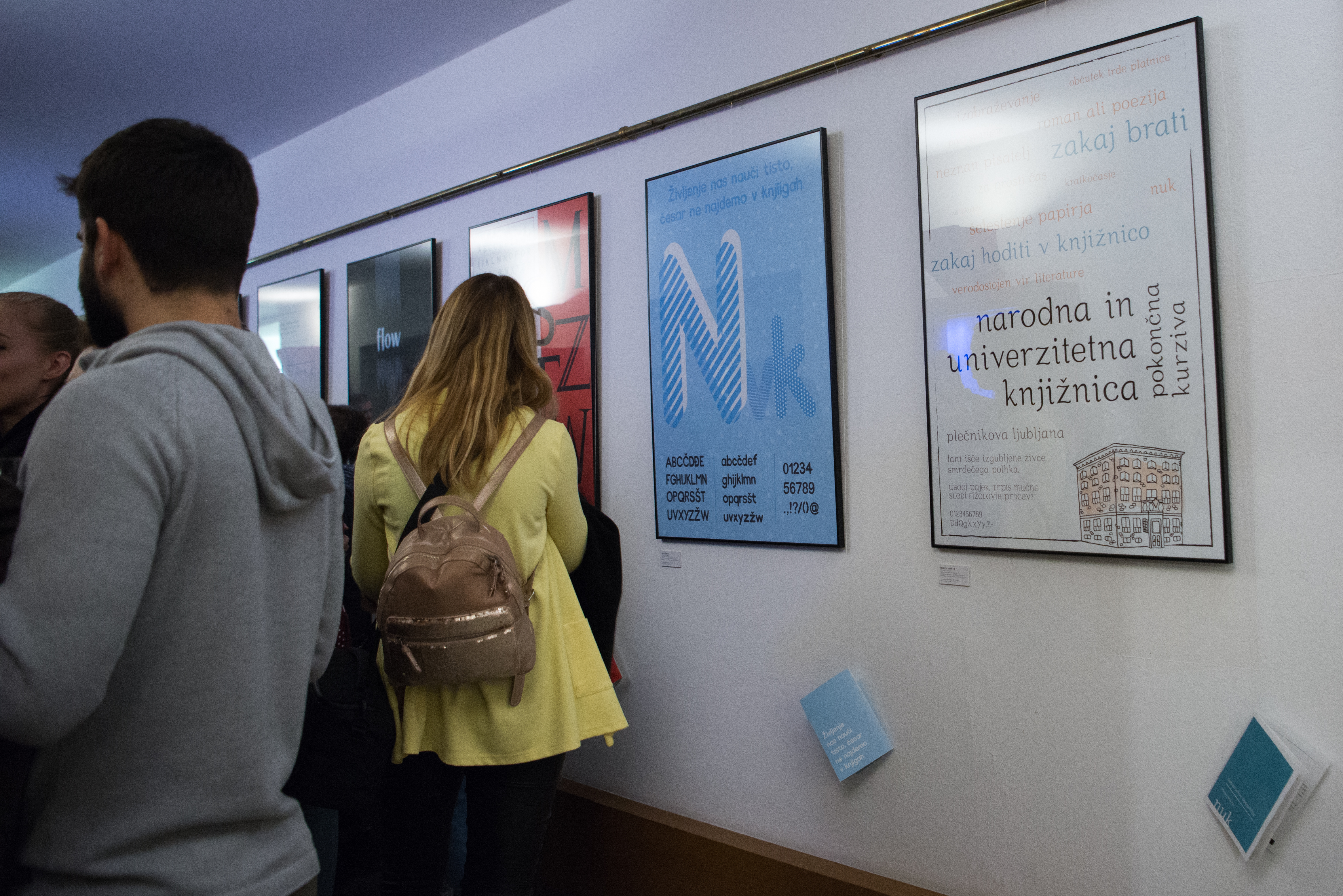
Letters are an everyday and self-evident part of our information society and we often forget that their appearance is important. The font format complements its content – emphasizing and enhancing it, or blurring and trivializing it. Choosing the right typography is more important than ever in the age of ubiquitous screens and messages. This is especially true for libraries – institutions whose life, activities and identity are inseparably linked to letters and are forced to rethink their mission in the changed information landscape. While preparing the program contents for the new NUK2 building, in collaboration with the Department of Textile, Graphic Arts and Design (UL NTF), we invited 15 Slovene and two visiting students to create their own typefaces for the National and University Library within the subject of Creative typography. Collaboration resulted in 17 original typographies in which students captured their visions of the institution, where centuries of tradition are intertwined with new information trends – as well as their own answers to the question of what a modern library should be.
About the project in the media:
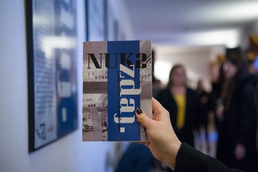
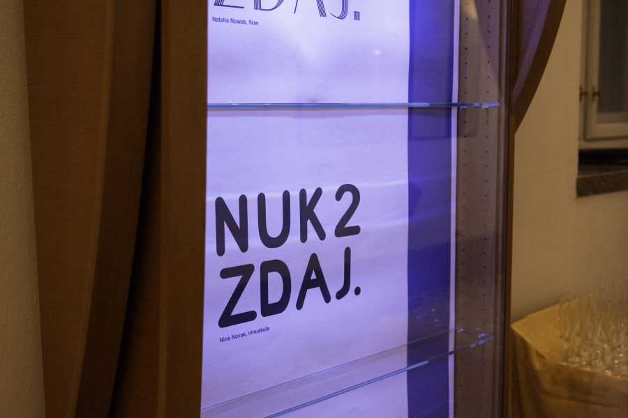
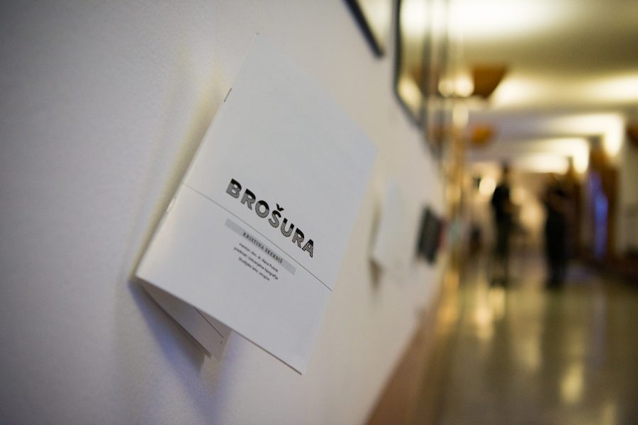
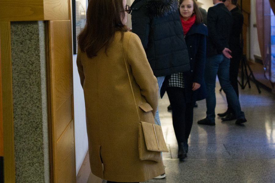
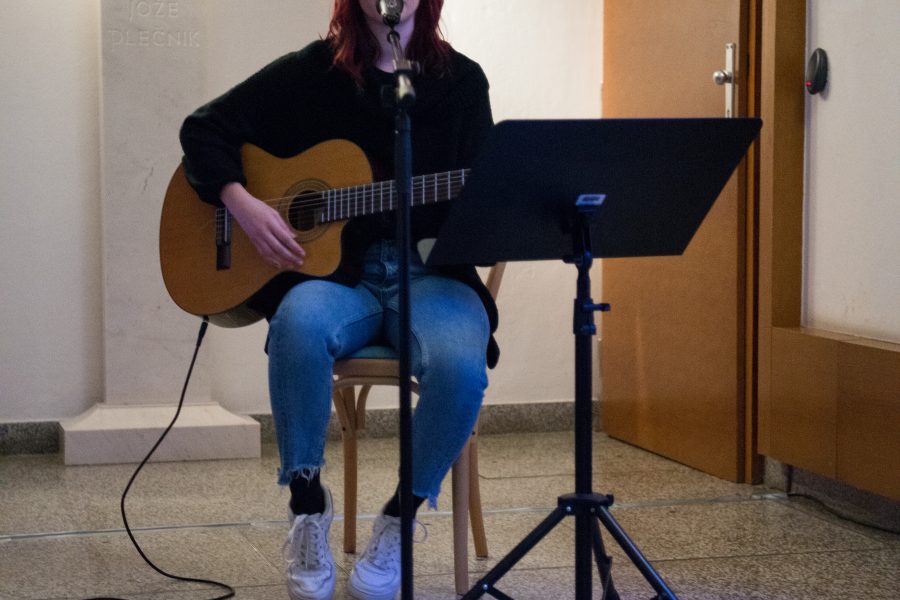
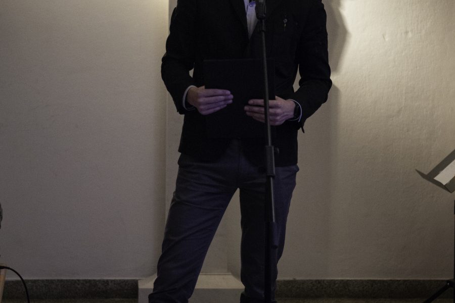
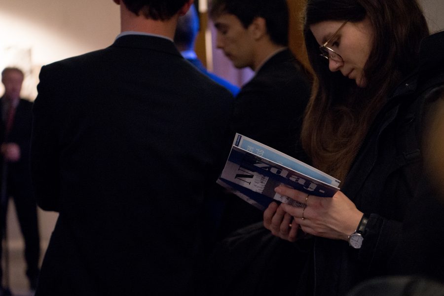
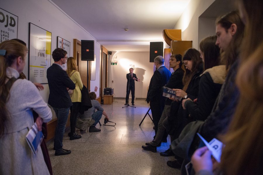
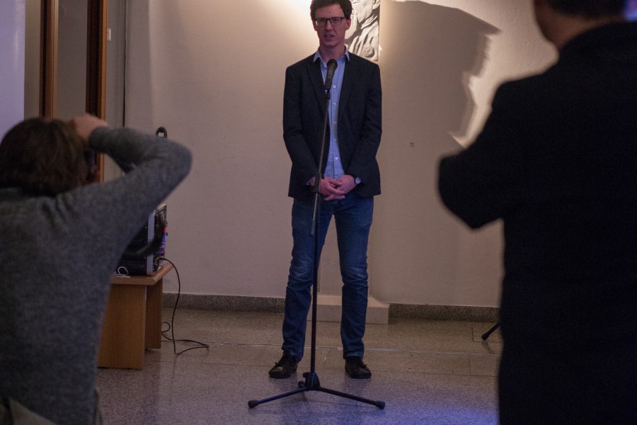
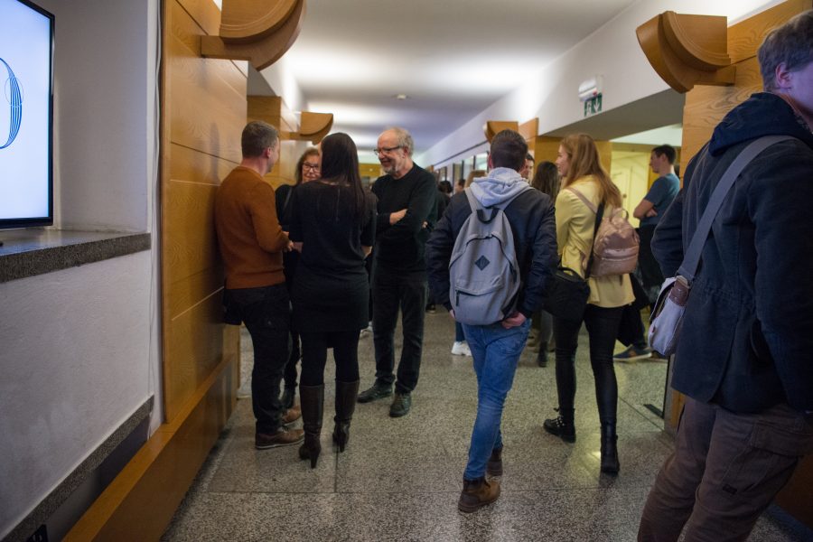
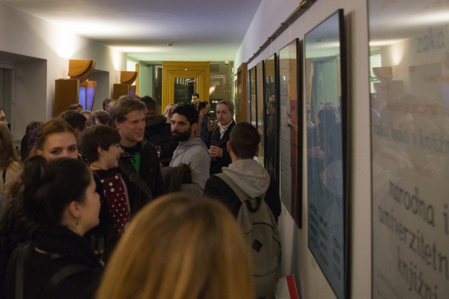
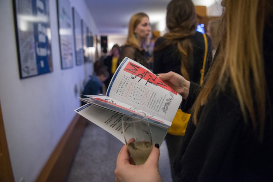
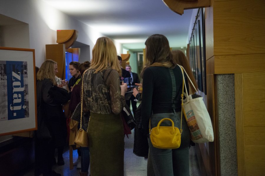
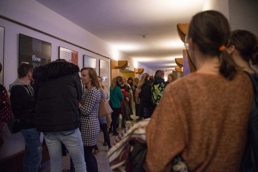
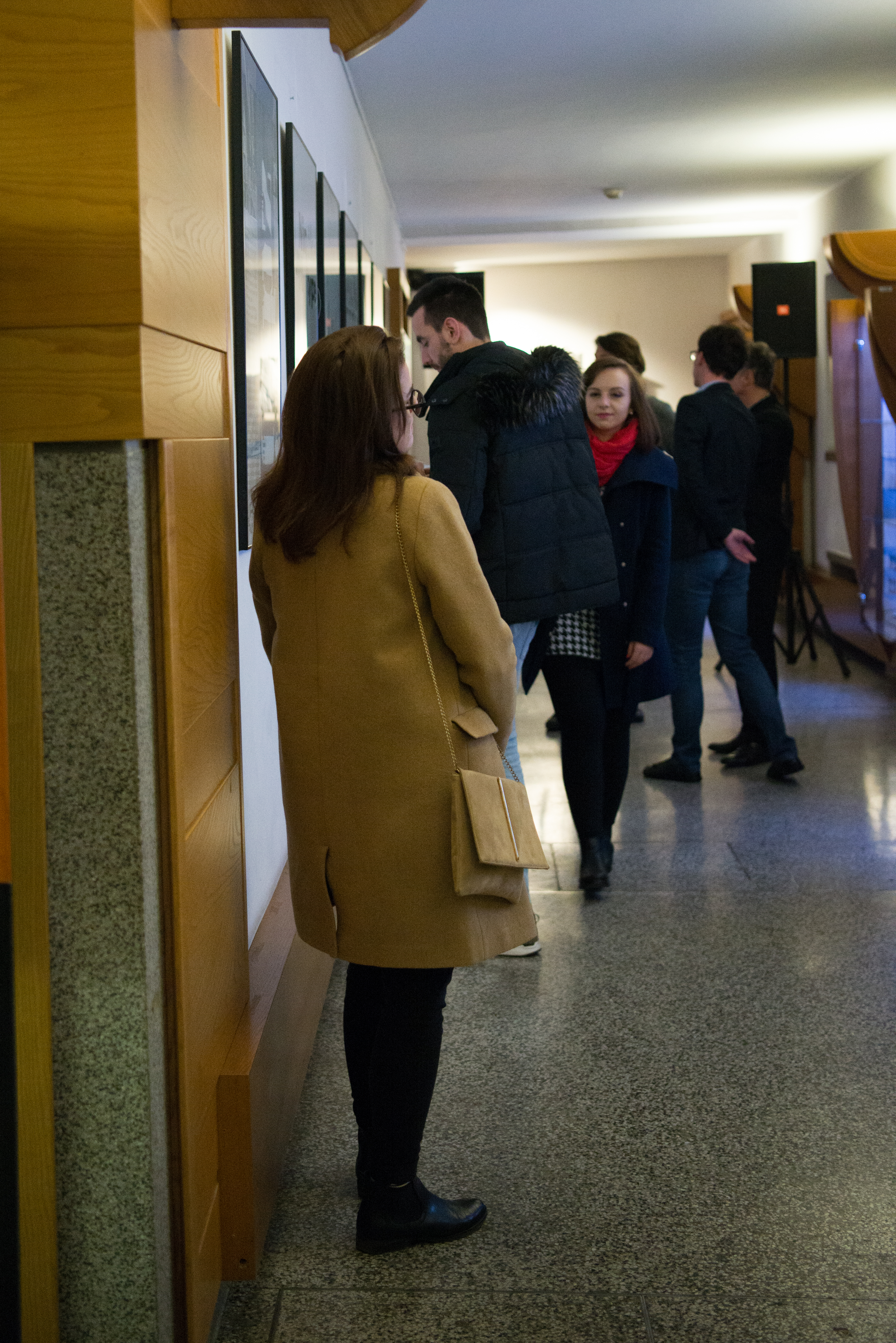
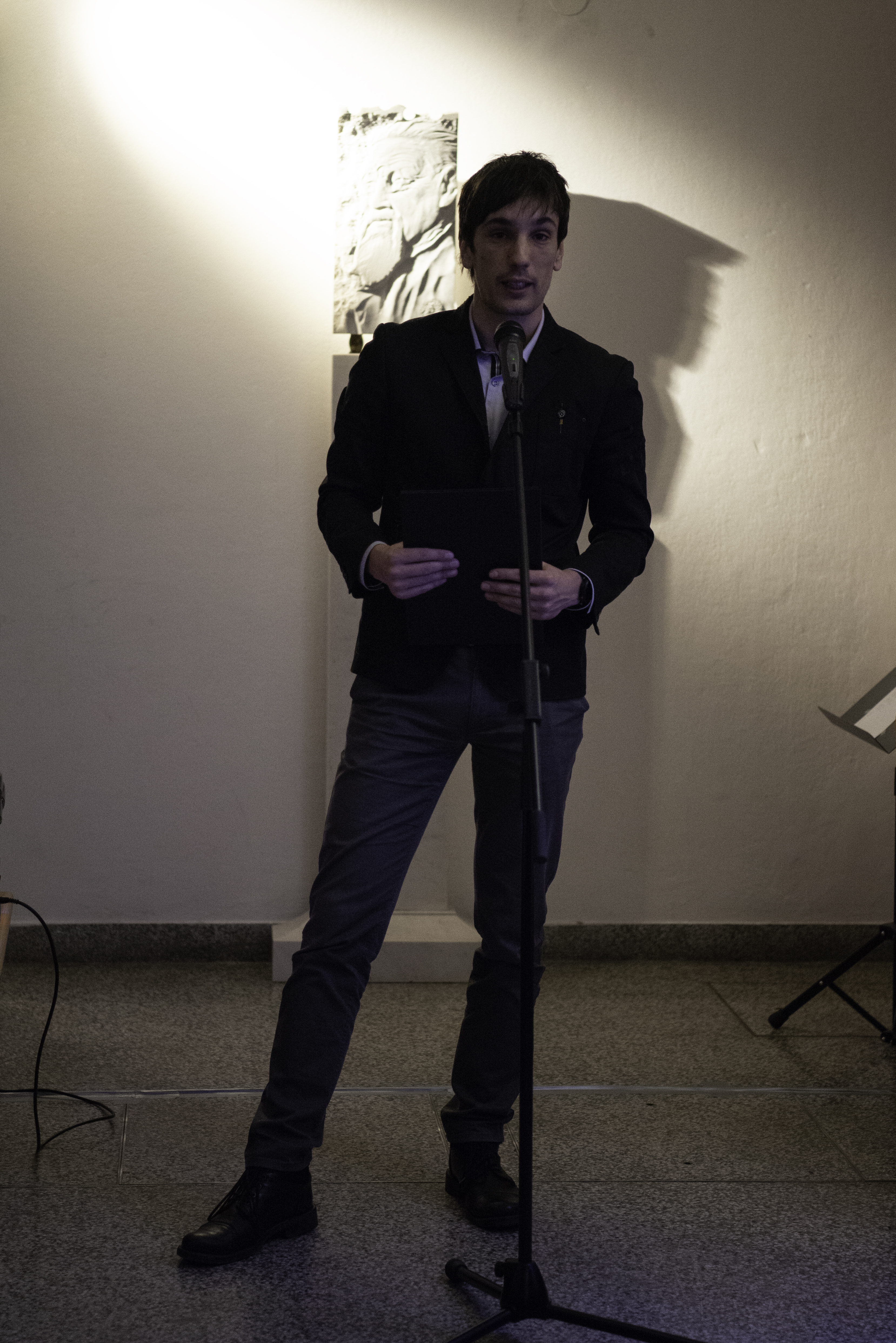
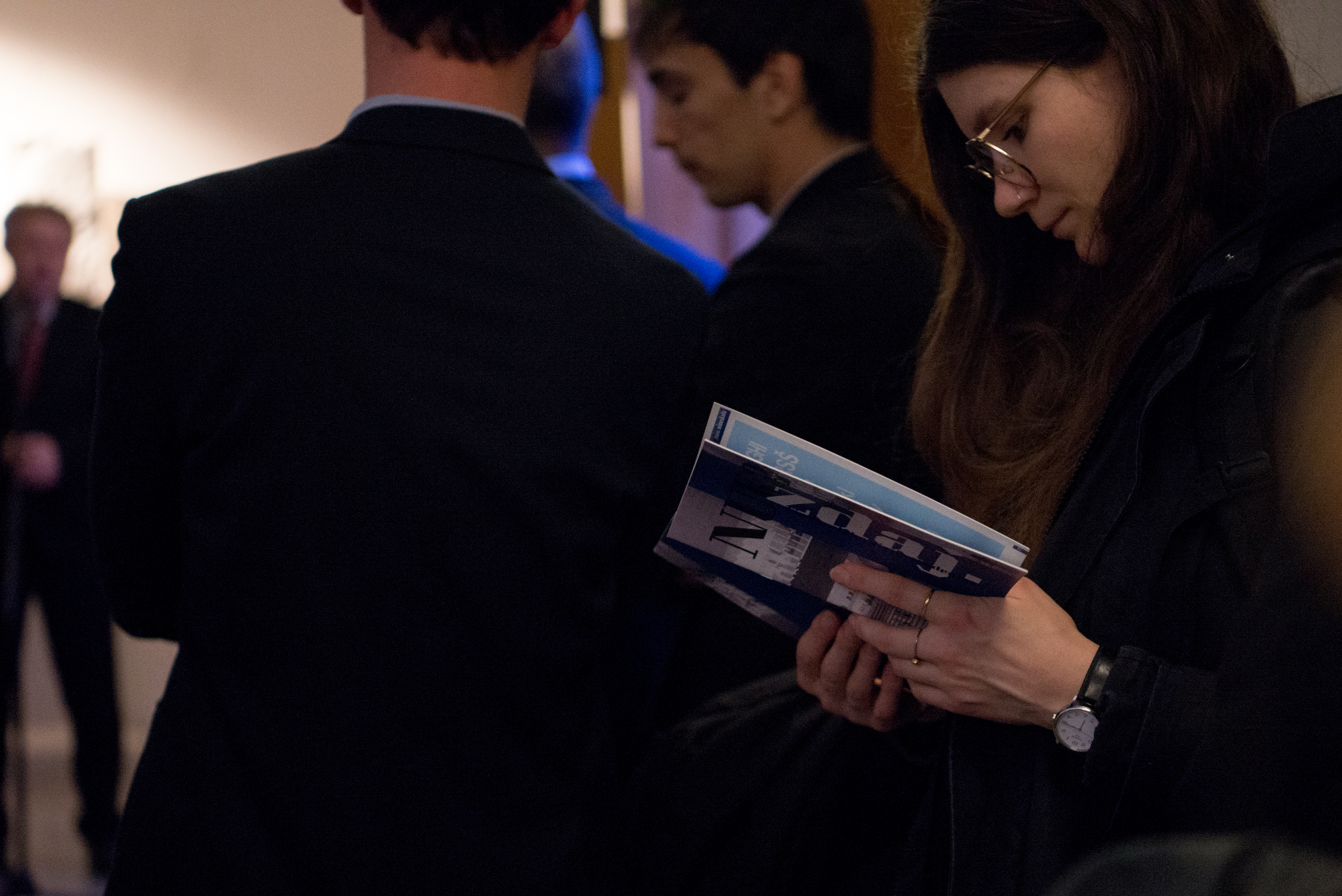
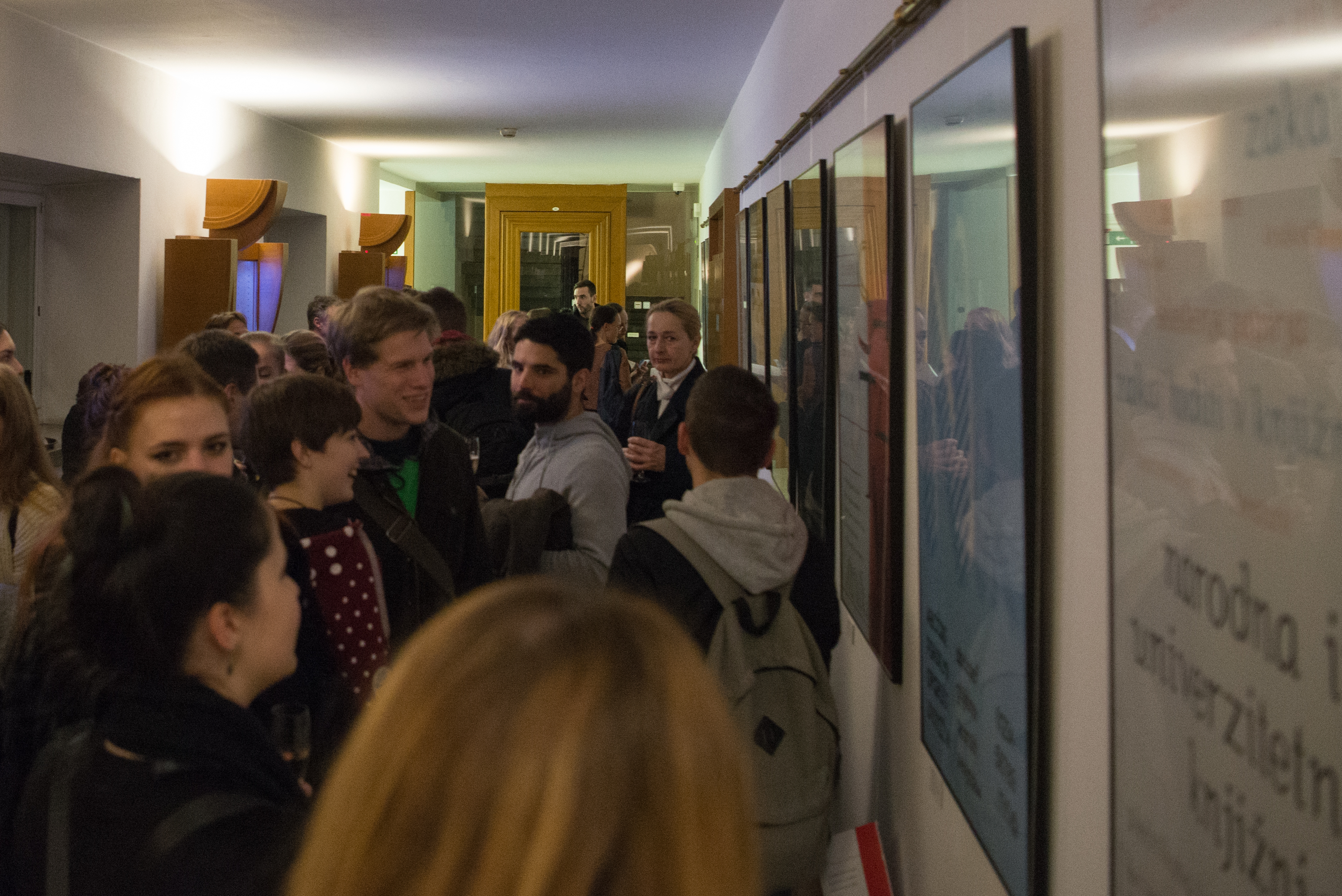
You can see some of the opening moments in the gallery below (Photo: Andreja Korošec).

