About project
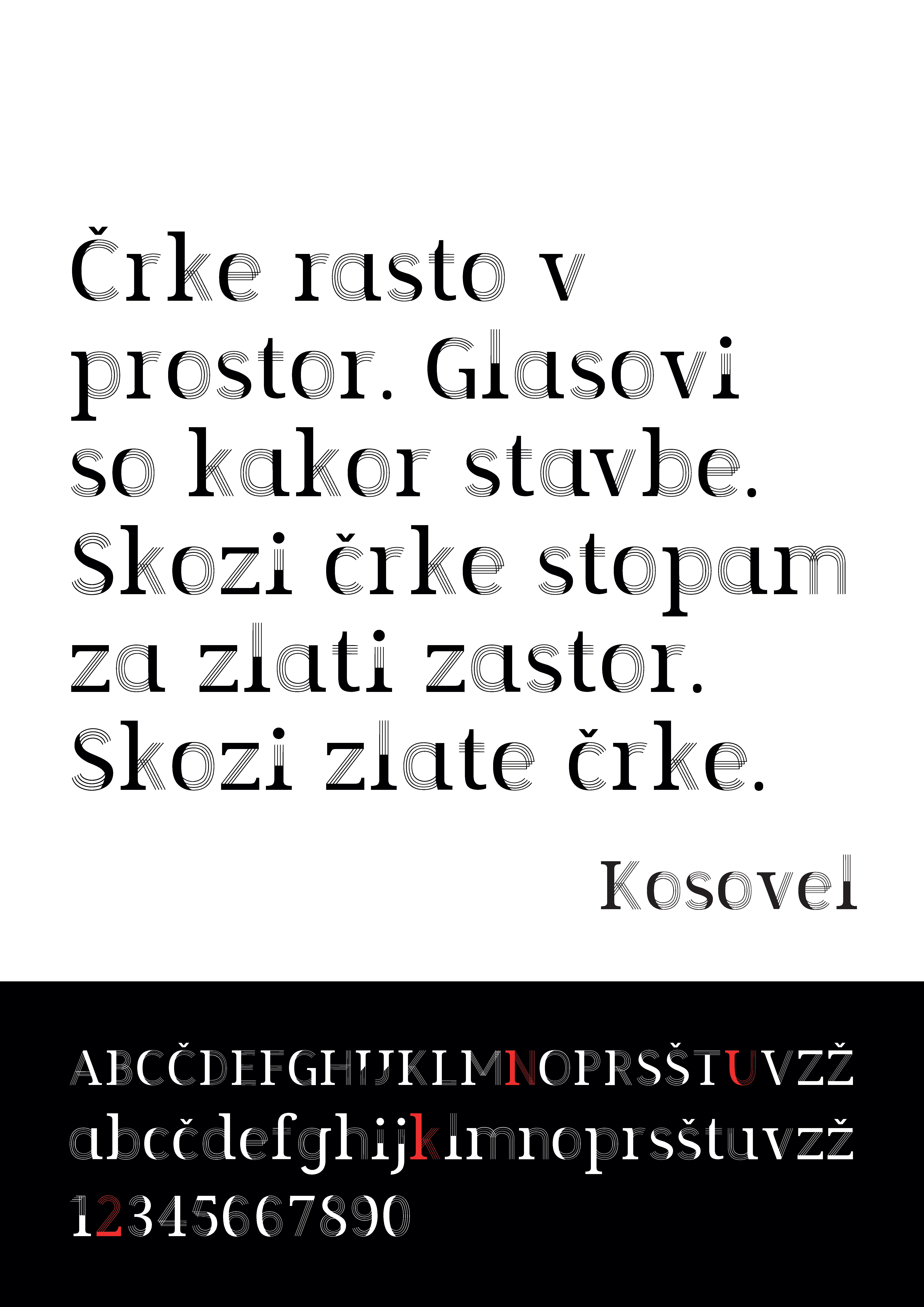
In the Kaleidoscope, Srečko Kosovel speaks of “letters that grow in space” and “voices that are like buildings”, thus portraying one of the most well-known constructivist principles “everything is architecture.” From this comes the idea of our typeface, which is actually a visual interpretation of the old and new NUK (abbreviation for Narodna in univerzitetan knjižnica; National and University Library), tradition and modernity, yesterday and today.
The National and University Library represents the pillar of Slovenian society and the design of the typeface for something so great, was a great challenge. We started the process by collecting and studying data on constructivism, Srečko Kosovel, analyzing the plans of the existing NUK and the anticipated NUK2. From the initial sketches, which were made only for the presentation of ideas, it was evident that the typeface would originate from the deconstruction of the old one, with the anticipation of something new and at the same time trying to create a different concept of space and time. For the most recognizable element, we set the pillar. We derived from the very essence of the National and University Library, which is a building block of the Slovenian society and from architecture, where the column as an architectural element represents a modular unit and gives a sense of size. We wanted to add to this the impression of the merging of shapes, in order to make these columns interdependent from one another and to create in full the effects of something new. Each letter therefore carries within it the element of tradition and modernity. Each elaborate element is the composition of the magnificent Plečnik pillars represented by the serifs, as well as the new parallel pillars of NUK2, represented by four slim lines. Our intention is that the new typeface will carry the beauty of the shape and the symmetry of lines, while at the same time it would be a synthesis of technique and art.
The project was carried out within the subject Creative Typography (master’s study of graphic and interactive communications). Participants were Tara Novak, Eva Ožbot, David Pihler and Maja Rigler, who also prepared the above explanation.
Mentor: Nace Pušnik